Same Room, Different Colours
Six versions of a bedroom, and the difference a palette can make.
A room can feel like a fresh morning or an invitation to stay in for the evening. It can be gentle, expressive, intimate or crisp. Much of that impression begins with colour, before we notice the individual objects.
These six interpretations share a familiar arrangement: a bed at the centre, a chair beside the windows, a bench at its foot. The details change, but the setting remains recognisable. Follow the colours from one image to the next and the atmosphere shifts with them.
As with getting dressed, a pale combination creates one impression; a deeper shade or an unexpected accent creates another. The interest lies in how the colours meet.
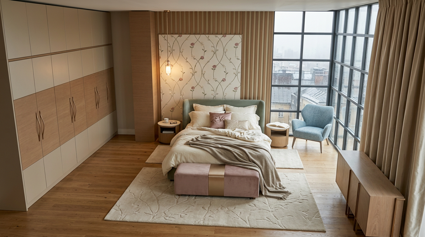
Soft Pastels: An Easy Morning
Sage green, powder blue and dusty pink sit against cream and honey-coloured wood. None of the shades asks for too much attention. The eye moves gently from the headboard to the chair, then to the bench at the foot of the bed.
Their softness comes from their muted quality. These are colours with a little grey in them, which helps them sit comfortably beside the neutral bedding. Warm wood keeps the blue from feeling chilly, while the pink adds a small note of warmth.
The room feels light and quietly informal, suited to an unhurried morning with the curtains open.
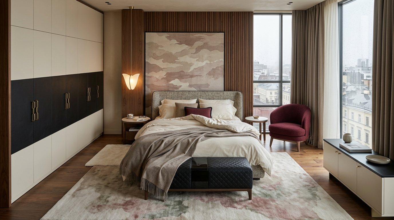
Cream, Black and Burgundy: A Little Definition
A dark band across the wardrobe and a black bench give this version a more defined rhythm. Against the cream bedding, those darker areas become clear stopping points for the eye.
The burgundy chair introduces a richer colour beside the window, repeated in a small cushion on the bed. That repetition matters: it connects the accent to the rest of the room, allowing it to feel deliberate.
Taupe softens the meeting of light and dark. The result feels composed, with enough warmth to remain inviting.
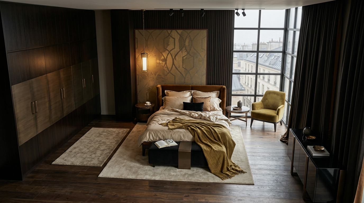
Chocolate and Ochre: An Enveloping Mood
Deep brown surfaces change the room’s sense of enclosure. The darker wardrobe, curtains and wall behind the bed create a continuous backdrop, bringing attention towards the lighter bedding and the window.
Ochre adds warmth in generous touches: the chair, the blanket, the golden tones behind the headboard. Beside chocolate brown, its yellow character becomes earthy and mellow.
The pale rug and sheets are essential to the balance. They give the darker colours room to breathe. Here, the same bedroom feels more secluded, somewhere to settle with a book while the city carries on outside.
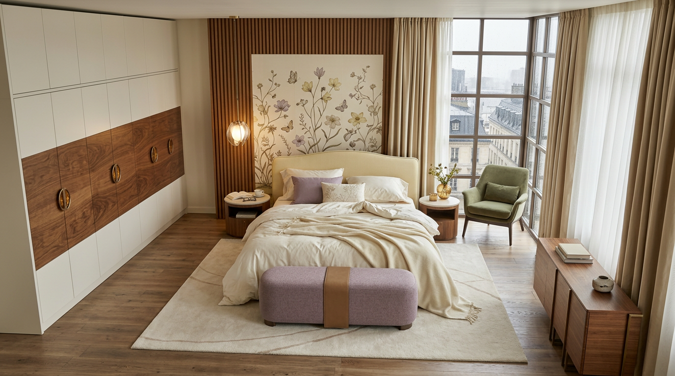
Butter Yellow, Lilac and Green: Quiet Optimism
A pale-yellow headboard brings a sunny note to this version. Lilac appears on the bench and a cushion, while a muted green chair completes the palette.
These colours have the familiarity of a garden: petals, leaves and the warm light between them. Cream bedding allows each shade to remain distinct, and the wood gives the delicate colours a warmer setting.
The mood is cheerful without becoming bright or busy. Even beneath a grey sky, the room seems to hold a little spring.
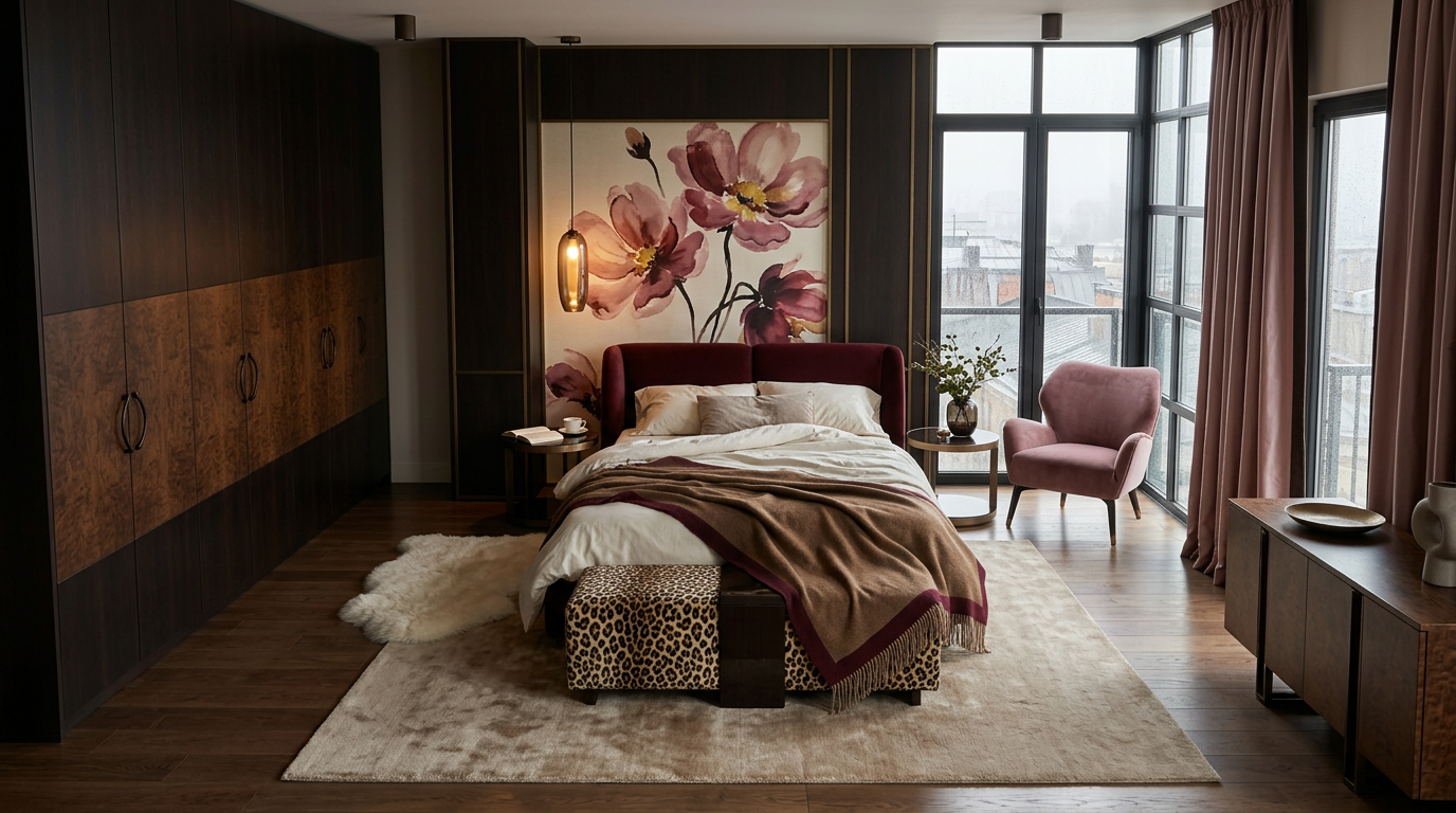
Wine, Rose and Caramel: Richer Company
Burgundy and dusty rose create a closer, more intimate atmosphere against the dark wood. Caramel spreads warmth across the bed, linking the deeper red to the brown tones around it.
What makes the palette interesting is the range within it. Pale rose lifts the composition, wine red gives it depth, and cream provides a pause between the richer colours. Their relationship allows the room to feel generous without every surface competing for attention.
The colour is more expressive here. It suggests an evening mood, with the lamps on and no particular reason to go out.
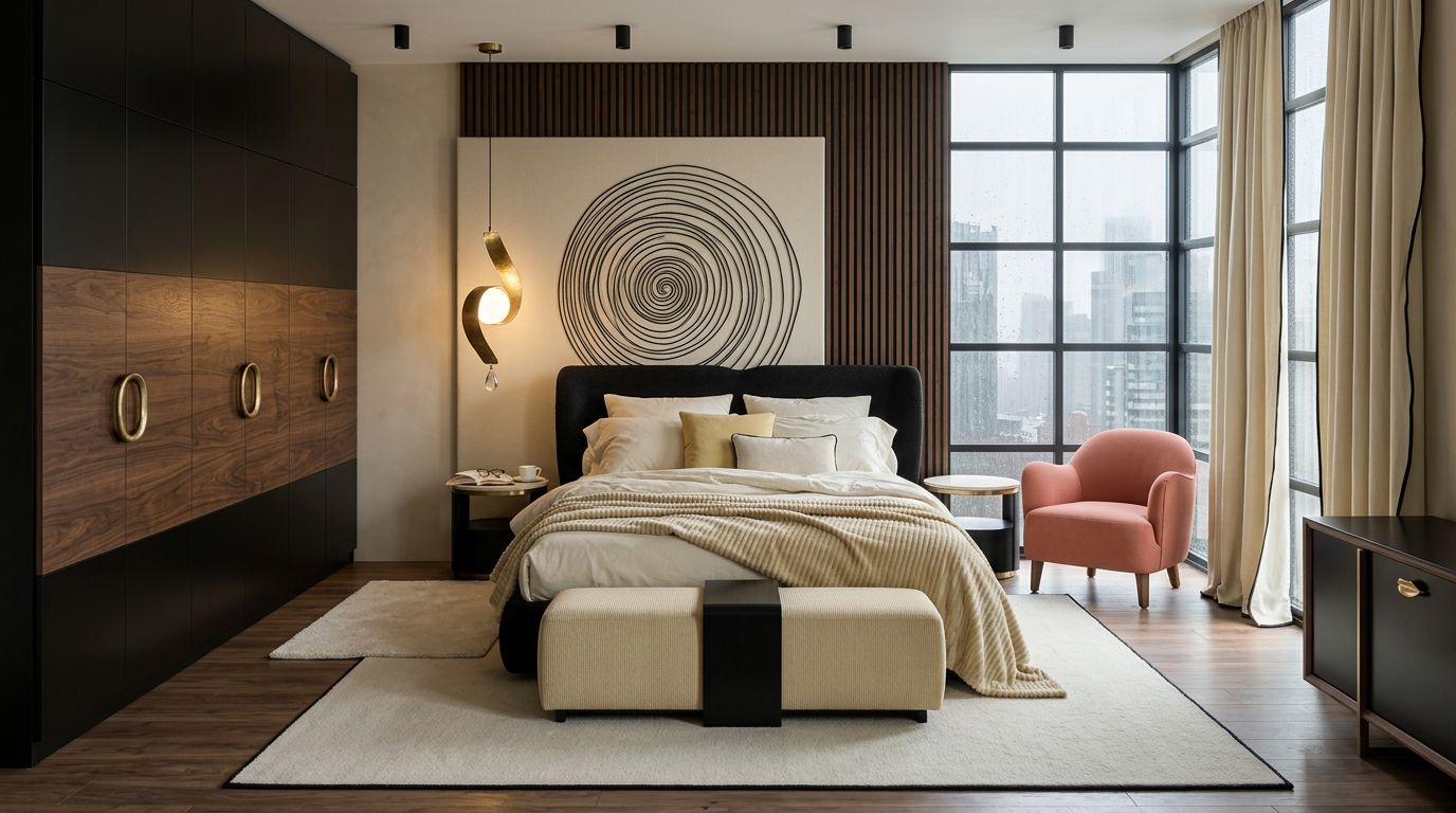
Black, Ivory and Coral: One Unexpected Note
Black and ivory give the final room a clear visual structure. The wardrobe and headboard establish the darker areas; the bedding, rug and curtains bring light back into the space.
Then the coral chair changes the tone. Its warmth draws the eye towards the window and gives the restrained palette a playful moment. A small yellow cushion adds another gentle point of colour.
An accent does not need to cover much of a room to influence it. Here, one chair is enough to make the whole setting feel more spirited.
Colour in Company
A colour changes with its surroundings. Pink beside ivory can look airy; beside dark brown, it becomes richer. Green feels different against pale yellow than it does against cool grey. Even a familiar cream shifts between daylight and lamplight.
The amount matters, too. Burgundy on a cushion is a detail. Across a headboard and blanket, it begins to set the mood. Texture adds another variation: the same shade can appear soft in a woven fabric, deep in velvet or luminous on a smooth surface.
These rooms offer six possible readings of the same setting. What feels restful or expressive will be personal, shaped by the light, the colours around us and the associations we bring to them.
Sometimes, imagining a different room begins with a simple question: what if this were another colour?